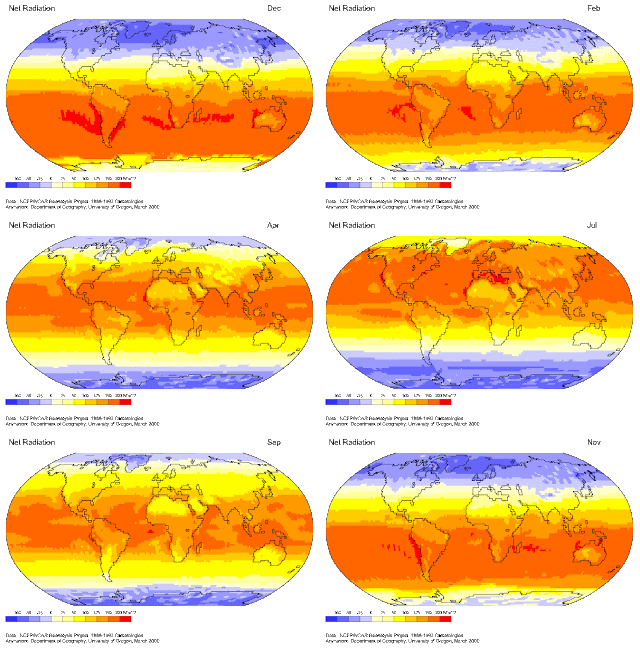
Maps hold the intention of expressing some type of data and sense of place fused together. The issue with places though is that they are never truly static; time changes things and often this element lacks in maps made on paper or digitally without animation. In order to better display this concept, cartographic animations are created to display the change of variables over time in a given geographic area. The animation shown here is the Net Radiation across the Earth, averaged for each month of the year from data collected during the years 1959 to 1997. The up and down motion of radiation across the Earth as the months go by shows how the seasons truly work, and it is plain as day to see how this trend continually occurs throughout a year as the map is in constant motion.

No comments:
Post a Comment