A star plot, also known as a radar chart, takes multiple variables and makes them different axes. Then, by entering various numerical relations about the variables, a webbing effect is made that shows their correlation. This is a simple two dimensional or three dimensional way to plot something incredibly complex. Seeing these variables put together makes understanding a correlation easier in an alternative way. The example of a star plot here shows how different rings on a polar coordinate system can be fused with axes and various colors to explain a complicated mess of variables and their associated relationships.
Through the Looking Glass
Sunday, July 17, 2011
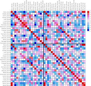
Correlation matrix
In a simple sense, a correlation matrix compares to points of data and creates a numerical relationship between them. This enables a researcher to take the data they need from a relationship and plot these values to see a possible trend in their research values. This particular matrix compares different types of tissues and sees their relationship based on a numerical scale.
Similarity matrix
A similarity matrix takes scores from a given grade system and plots the similarities between the two. There are a variety of applications and the implementation of it is not easy without the use of a computer at a high level. The matrix shown here is a comparison of popular musical artists and how they interrelate with each other.
Stem and leaf plot
Stem and leaf plots take a collection of arbitrary numbers and aid in organizing them so they are ready to be graphed into a different form, such as a histogram or a box plot. This is started by breaking the graph down in “tens” and “digits.” The numbers on the left of the “stem” are the “ten leaves” and represent a value in the ten place. The numbers on the right of the “stem” represent the “digit leaves” and represent a value between 0 and 9. This aids in organization and makes it much easier to understand and evaluate data. Here we can see that the test scores from a recent math test were less than perfect as many students received a grade between 10 and 19 percent.
Box plot
The box plot, also known as the “box and whisker plot”, is a statistical graphing tool that breaks down a set of data into five quantiles considering the minimum, the lower, the median, the upper, and the maximum. There are also occasionally points of data that do not fit in with any and they displayed a simple empty dot on the chart. Looking that box plot shown here, we can see the minimum had most sales between 1,000 and 2,000 widgets, but went as low as almost 0 and as high as 2,500. The median was 1,500 widgets for the minimum group X and the statistical averaged minimum was around 1,600 widgets.
Histogram
Understanding the frequency of occurrences over time of an event or value is an important aspect of scientific research. The histogram is a graphical analysis that allows the cartographer to easily display and see how trends happen with relation to time and a variable. There is an x-axis that is considered some unit of time and there is a y-axis that is the variable in study. A color coded system can also be used to distinguish another variable considered in the study. The map displayed here is a histogram relating the years of 1891 to 1970 through 10 year ranges to US immigration rates from Northern Europe. The colors represent the countries that each population came from. It appears that the Swedish immigrants entered into the United States mostly between 1891 and 1910, however dropped off soon after as many other immigration nationalities did according to this data.
Parallel coordinate graph
The study and understanding of multiple variables simultaneously is a difficult and tedious task. At times, it is necessary to perform these studies in order to get a more simplified picture of what is going on between the relation of these variables. The creation of these graphs involves very complex algorithms and geometric designs that only computers can truly offer in some cases. The graph pictured here is an example of a very complex mathematical algorithm plotted among many variables simultaneously.
Subscribe to:
Posts (Atom)


